


More Google Messages beta users now have the Material 3 Expressive redesign of the chat interface, while it’s also beginning to appear on the app’s homepage.
M3 Expressive started rolling out to the conversation UI on Monday for some users. More people are now seeing it with beta version 20250602_05_RC00 rolling out today. (You might want to Force stop Google Messages from App info once or twice to get the revamp to load.)
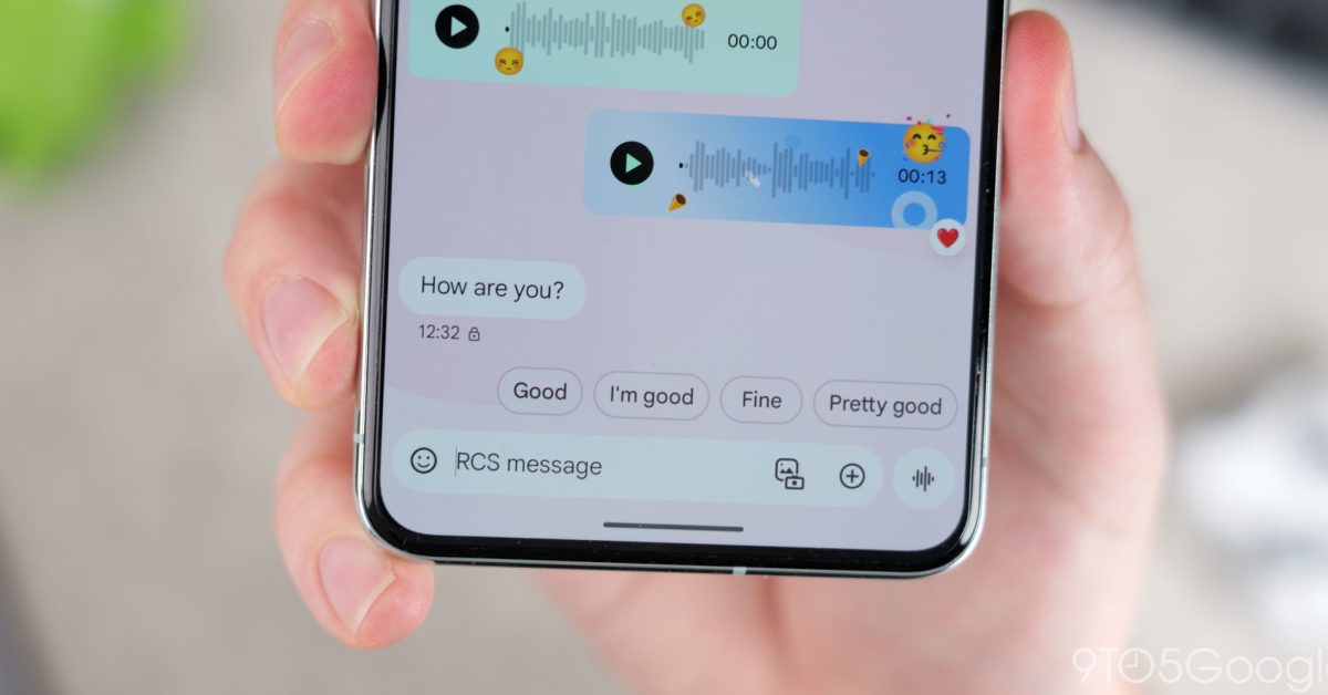
Old vs. new
You might miss how the top corners are now rounded to indicate that the conversation bubbles are housed in their own container independent of the app bar. Google has removed the subtle, bubbly backgrounds for a solid color/design.
The more obvious updates are to the ‘plus’ menu and pickers for Emoji, GIFs, Stickers, and Photomoji. They are housed in their own rounded container, though the background color is identical to the top bar.
The various actions are now housed in pills that lack colorful backgrounds, while the grid size is not as dense. Meanwhile, the expressive media picker lets you experience the new connected button group where the current tab becomes a pill.
Meanwhile, there’s one report of the Material 3 Expressive redesign on the Google Messages homepage. On foldables, the conversation list appears alongside the chat view for a dual-column layout. The aforementioned list is simply housed in a container, while the old ‘G’ logo is placed in a circular container.
Add 9to5Google to your Google News feed.
FTC: We use income earning auto affiliate links. More.
